Check out these iterations of Eventbrite checkout 🛒
Summary
Sometimes small changes can lead to big wins. Here are a few content iterations I made to our checkout screen at Eventbrite, and how they brought higher publish rates and more revenue for the company.
The Problem
Our current checkout experience wasn’t converting as many creators as we’d hoped. There wasn’t enough information about how our prices were determined.
After the initial launch of our pricing and packaging restructure, we noticed lower-than-desired publish conversion rates and upgrades.

A couple of reasons why:
Choices felt too binary. You were only given a Flex pay-as-you-go option and a Pro subscription recommendation, and couldn’t see all the plan options unless you cleared the blue learn more link at the bottom of the screen.
The correlation between event capacity and price was unclear. It was hidden in the second bullet of each card. The prices creators were seeing at checkout were determined by their event’s capacity, or the maximum number of tickets they wanted to sell. There wasn’t any clear education around why they were seeing the prices they were seeing, and what was driving these prices. I really had to work on driving that point home.
Not having the ability to switch between capacity tiers caused unwanted user behavior. Because users weren’t given all the information they needed at checkout to make an informed choice, they actually hit the back button and jumped back to “edit” their capacity in the Ticket step of the event creation flow, then jumped back into the checkout screen to see if the prices increased/decreased. This caused frustrating back-and-forth behavior. 😵💫

Select a plan step in checkout.

Review and pay step in checkout.
The Solution
Our mission was clear: increase event publish conversion rates and tier upgrades. The content updates I made were designed to elevate the user experience from event publish to checkout.

Here’s how I enhanced the checkout experience:
“NEW💸” pill highlight for event balance benefit
Stakeholders wanted a clear indicator within the "select package" step that highlighted the option to pay with event balance which was exclusive to Flex pay-as-you-go plans to reduce friction on buying decisions.
I chose “new” because it was the clearest and shortest piece of text that could fit in the same line of the plan card (at least in English). I also used an emoji to attract more attention and complied with emoji accessibility guidelines by keeping it at the end of the sentence so that screen readers wouldn’t read off the emoji meaning in the middle of the sentence.

Edit Capacity Dropdown
The team added the ability to modify event capacity directly within the checkout flow to reduce the friction and back-and-forth behavior.
I convinced the team to make the dropdown longer and include a “Why is this important?” tooltip to further inform the user about event capacity and how it tied to price.
We also updated the updated the plan pill badge colors globally to enhance design consistency across various stages for a clearer user experience.

Select a plan step in checkout, updated.
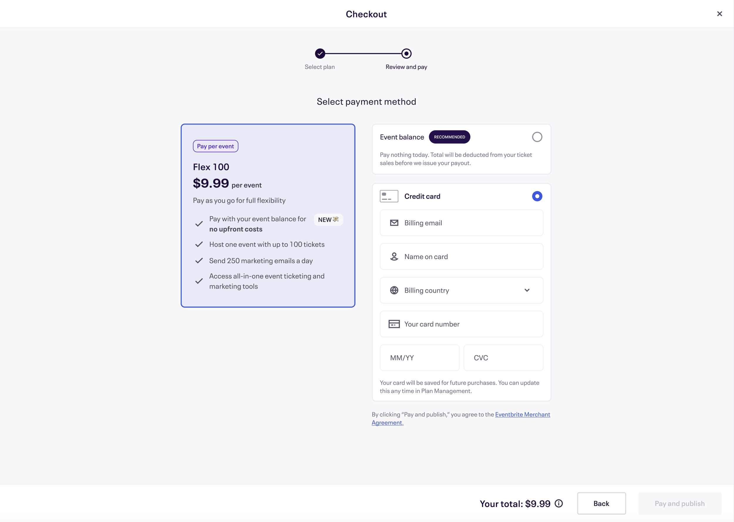
Review and pay step in checkout, updated.
The Results
These content changes resulted in higher checkout conversion rates. 💥
Since launch, we witnessed a 7% increase in conversion rate from Event Publish Start to Event Publish Checkout. We also saw a 2% increase from Event Checkout Start to Event Publish.
While these numbers might seem modest on the surface, the cumulative impact is substantial. Considering our large user base of nearly 300k creators at the top of the funnel in the month that we launched, this translated to an additional 5,000 users converting, each contributing to revenue growth. Moreover, nearly 100 users chose to upgrade to Eventbrite Pro, which bolstered our Monthly Recurring Revenue (MRR).
But here’s what I would’ve done better:
I originally wrote “NEW” in all caps to draw attention, but later realized all caps isn’t as accessible as sentence case and would change it in the next iteration.
Event balance also wasn’t technically “new,” since event balance existed as a payment method for Flex since we launched the whole experience. So I would also want more time to explore a more appropriate, yet short word. (Got any ideas?)
I also wrote content for an express checkout experience. 🛒💨


Our product team also created an express checkout experience that launched at the same time as regular checkout.
Express checkout was for returning creators who had a saved payment method. They could pay to publish their next event in just one click.
We automatically took users to this experience if they fulfilled that criteria. I made sure to have an option where they could see all their options for full transparency with the “Select another plan,” as well as a learn more link to our full Pricing page, which would open on a new tab.
For creators who were subscribed to an Eventbrite Pro monthly plan but needed to upgrade a specific event because they wanted a higher ticket limit, they were also served the express checkout experience.
Example: You’re subscribed to the Pro 100 plan and can publish unlimited events a month with up to 100 tickets each. But you’re creating a one-off event this month that needs 200 tickets. You’d need to upgrade.

Express checkout title became “Upgrade your plan” to be clearer of what it is you were paying for. Looking back, I could’ve changed the screen title to “Express checkout” for all situations.

Expanded view of the “math” of why a user is being charged a certain upgrade fee. Used subtitles on the line items to explain the plan and what was “pro-rated.”
Express checkout made some speedy impact, too. 💸
Express checkout made $1.5 million in revenue for the company!
For returning creators, the overall conversion rate for express checkout was 41.3%, compared to 57.5% for regular checkout. While express checkout was lower, when we compared results by filtering for checkouts that were completed within 10 seconds, the conversion rates were 41.3% for express checkout and 4.5% for regular checkout. So if you went through express checkout, you sure went fast! 🏃🏻♀️
Here’s what I would’ve iterated on:
Change screen name titles to “Express checkout” so titles could be flexible. When a Pro subscriber needed to upgrade their plan for a one-off event, the express checkout title became “Upgrade your plan,” which could make users believe they’re in a different experience. I could’ve used the screen name title as “Express checkout” to do the work of aligning the flow’s name, and then could’ve made the actual titles more actionable and contextual.
Change clunky jargon like “preferences.” While I originally thought it was a scalable term for all situations (whether you paid with your event balance or your credit card on file) I could’ve been more specific.
Make express checkout’s design feel more “Eventbrite.” Now that the MVP was shipped, we could work on branding on and design to make this payment screen feel more aligned with the overall colors and branding of Eventbrite and the regular checkout experience. This could boost trust with users and assure them that, yes, they’re still on our website!