Adding Hierarchy, Agenda, FAQ, and Tips to Eventbrite’s Create Event Flow
Skills I used:
Information architecture / Content hierarchy
Feature naming
Creating new features
Benchmark testing / competitive and comparative analysis
Summary
Though event creation is a core experience for Eventbrite creators, it wasn’t optimized—until now. I contributed and executed UX/UI and content improvements to Eventbrite’s event creation flow. You can also check out my work on Eventbrite’s new AI Event Create experience.
The Problem
The event creation flow is the primary way our creators create events, yet our existing experience was outdated and convoluted, resulting in unsatisfactory user experiences and drop-offs at various steps. Some known problems included:
Creators couldn’t preview their event page on mobile devices—even though 70% of event page views on Eventbrite come from mobile. This means that creators can't preview how their event will look on mobile, even though the majority of consumers discover events this way.
Our desktop publish rate was 74%, while our mobile publish rate was only 33%!
Our current image ratio 2:1 fits for desktop views, but not for mobile views. The ratio is horizontal, but what is needed for mobile are vertical images.
Our creation flow also provided very limited media content and features. In fact, past research had shown that imagery—including the event header and hero image—were the parts that consumers viewed the most on an event page.
There was also a lack of guidance on what makes an effective event listing page on Eventbrite.
If we could improve general UX issues, introduce simple and intuitive mobile patterns, and include richer content offerings in our flow, then we could increase the mobile publish rate, improve conversion in the event creation process, and guide our creators to produce high-quality event pages.
As the Content Designer for this project, my focus was on providing more structure to our creation flow, more media/content features, as well as more tips, education, and overall guidance.
The Research
Content Creation Benchmark
I helped conduct a content creation benchmark that showed current creation flows by competitors and aspirational brands like Universe, Viator, Facebook events, Airbnb, Square, Hopin, and Etsy that compared them to Eventbrite’s current creation flow. This would help create a design vision for how we wanted Eventbrite’s “richer” content creation flow to function like.
The 61-page document was structured around five categories:
Building path: describes the different tasks a creator follows to publish their event.
Building interaction: looks at how other platforms deal with input and output information in the building process.
Customization: analyzes how other platforms allow users to customize and personalize their content
Guidance and Education: looks at how other platforms guide their users through context, tips, or templates.
Multi-device creation process: understand how others optimize their creation flow across devices (desktop view vs. mobile web view vs. mobile app)


Ultimately, we found that:
We needed a detailed, but fast creation process that considered how often our creators unique vs. recurring events. If we wanted to add new sections (like an FAQ section or Agenda section to reduce the length of event descriptions), we’d need to be conscious of where we place them and if they should be optional to get out of a user’s way. We’d also need to explore if our current order of tasks is the most optimal. We can see in other platforms that there's a diverse way of asking creators about information that doesn't necessarily correspond to how it is displayed on the listing page.
A needed a more fluid experience between showing input and output information, especially since the team was considering adding more sections/modules to the flow.
Full customization is great when builders need to cover very diverse needs and purposes, from building a website for a small business to an artist’s portfolio (ex. Square, Squrespace, Wix, etc.) However, our event pages coexist together in a single marketplace, so there must be some consistency to them. Therefore, we should lead towards a path of limited content customization, more similar to Viator, Hopin, Airbnb or LinkedIn in which customization is reached through a limited content choice and high-quality input from creators. In all of these platforms, content is structured in modules of information with many options to fill that users can add to fit their needs.
Quality is another thing to consider when looking at customisation. When allowing users to full customise their listing pages, we are not owners anymore of the listing page result. To ensure a minimum quality for the listing pages, we must guide the creators to include high-quality content instead of the freedom or creativity to fully customise it. We must drive them through different content modules with the flexibility to choose the most optimal and the flexibility to add or skip some of them. This is the way to ensure a marketplace with quality listing pages, to create patterns for the consumers while generating some differentiation between events.
When it comes to guidance and guiding content: we should aspire to be like Airbnb and Viator, who provide contextual guidance through tips and learning more via resources without getting in the way of the main job to be done (ie. publishing an event). Including context for each section, tips and insights for high-quality content in the photographs, description and future sections and access to good examples pictures and written content.
Another exciting idea that's worth exploring is gamification. As soon as we introduce more sections in the listing page, we will require more action and work from creators. This could lead to a more tedious experience and drop conversion, especially for those creators looking for a faster creation. We must therefore balance well the flexibility between mandatory and optional steps. Gamification could be a great way to encourage users to fill optional steps and add more high-quality content to the listing page once they have completed the minimum standard we propose to them.
Content Segment Test
I also partnered with User Research to conduct an unmoderated content segment test via UserTesting. The purpose of the study was to gather insights into which content segments consumers need to see on the event page, and what information they expect to have under each content segment. By prioritizing consumer needs and expectations, we could build sections for creators that would be more effective, since they would align with consumer needs. It would also help us in naming these new content sections/features in the creation flow.
Participants were asked to describe what they considered to be primary and secondary information when deciding on attending an event, to identify what information catches their attention most on an event page, and to identify the information they expected to see for a list of content segments we provided.
How did we determine which sections to present to consumers? This was based off of looking at some of the events across the globe that made the most ticket sales, and observing their event pages to find common themes and patterns of what made them effective. We tracked those themes and patterns, while also asking our Customer Support (CX) team based on the influx of contacts they received of what would help curb attendee questions:


We found some common themes, which included: a summary, “what to expect”, FAQs, safety, accessibility, what you need to bring, ticket type/what’s included, refund policy, an FAQ section, and a schedule/agenda section.
So, we tested all of these potential segments to attendees and asked them what they’d expect to see in each.
Our key findings included:

The three new sections that would be included in the event flow, plus renaming an existing section to “Summary” based on the content segment test’s findings.
The primary information participants reported needing to see on an event page fall under five categories: basic but essential (cost, date, location, time/duration), specifics about the event (event overview, type, capacity, seating arrangement), itinerary/schedule, getting there/arrival (directions, parking), and requirements (dress code, age).
Based on the most frequently mentioned information, this type of content might be what consumers need to see earlier on the event page.
Our creation flow would need to up-level this information in the creation flow, so that creators could complete this info first.
Information that builds trust like photos and reviews, as well as indicators for special discounts or perks were attention grabbers.
This helped me determine what my tips and guidance for creators should be around: how to choose effective event images.
There wasn’t a lot of clarity on what participants expected to see under the “what to expect” segment. This segment featured a wide range of categories that were accounted for in other segments. This may signal that “what to expect” is too broad of a segment.
So instead of calling this section “what to expect,” consider “About this event” or something else.
The categories we saw under secondary information include itinerary/schedule, getting there/arrival, trust/credibility builder, offerings, requirements, and alternatives. Although consumer feedback was spread out across the categories, we saw an emphasis on having an itinerary/schedule that featured information about the artist/performer/speaker/vendor at an event by over half the participants.
This inspired my team to explore an Agenda/Schedule section in the creation flow.
The summary segment encompasses several the categories consumers identified as primary and secondary pieces of information.
This helped us determine to keep our current “summary” section—and that the name “summary” resonated with consumers.
Participants indicated that they would like to see the FAQ section have the most common questions and answers curated by the host, a section for attendee driven questions, and an option to directly message the host via email or chat.
This inspired my team to explore an FAQ section in the creation flow.
The Solution
Aware of our creation flow problems and having a better idea of what we wanted to improve (and potentially what to name them), we decided on three themes:
We need our creation flow to be mobile first, since event pages were mainly consumed from mobile. So, the experience has to be optimized for those sizes.
We needed to provide more media tools that allowed creators to express themselves. They need to be able to easily and quickly adapt the content of their event.
We needed more tips and best practices to help creators understand what makes a high-quality event page that could lead to more ticket sales.
Some ways we could to this was by:
Reorganizing content hierarchy and take a “modular” approach, based on info that mattered to attendees when buying tickets
Create image best practices
Consider adding optional sections for creators to add in an FAQ or a timeline of events (ex. lineup)
Providing crop and previews
Image carousel / better media management
Videos in the image carousel
Provide input/output interactions


We would measure success by an increased mobile conversion rate (since that was the main device we wanted to improve), an increase in monthly hosting creator usage of the new tools we’d introduce (ex. image carousel, video integration, and any new content modules we created).
We’d also make sure consumer views of event pages didn’t drop, observe our quarterly creator satisfaction surveys, and make sure customer support contacts didn’t surge due to these UX/UI changes.
The Werk (How I got There)
IA/Content Hierarchy


Writing Image Best Practices Tips / see examples
What was informed was through attendee findings
Naming Agenda and FAQ
Usability Testing
Now that we had designed new sections, written some tips, and made some adjustments to our creation flow’s hierarchy, we wanted to evaluate our updates with Eventbrite creators: we wanted to gauge creator sentiments, understand the helpfulness of the tooltips and examples, and uncover usability issues in the flow before launching to our entire creator base.
Users find value in the content segments, and most believe all segments but summary, agenda, and FAQs are required.
Adding content to most segments was a simple process however, the steps needed to add an agenda were unclear and caused confusion.
The tooltips and examples were helpful learning tools for users, but some of the tips felt ambiguous.
Having the ability to preview an event page was well-received by users.
Users want content to auto-save as they fill out the segments.
Based on these findings (below) I woud: improve image empty state copy, focus on the value and “why” following our tips would be effective, work with my Product Designer to improve our Agenda feature’s UX, and consider an auto-save feature and feedback system.


We also conducted more specific usability tests for both our desktop and mobile experiences, which included questions around content. The majority of our feedback was positive, and many felt the updated flow was straightforward and easy to following. And naturally, our creators provided some content feedback that informed my work:
Specifying what “upload media” means as a CTA, and also align mobile image UX/UI to the desktop version to be clear with mobile creators that it is an actionable space
Instill more confidence via content about timezones when setting up time and date of the event
Consider auto-save functionality (which was already raised in the previous research)


The Result


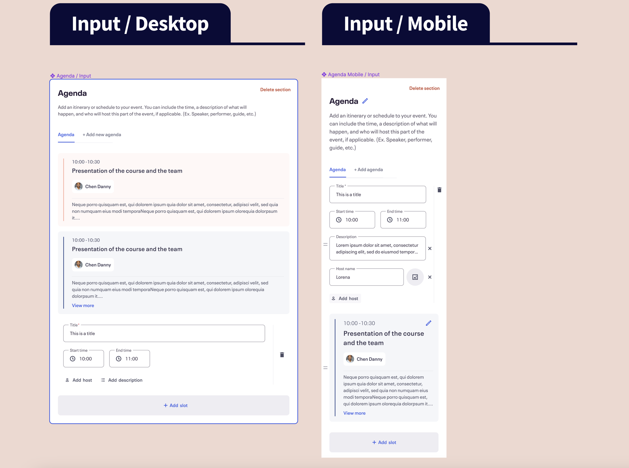


Agenda:
Value for Creators: it allows creators to break down their events into sections and assign topics, speakers, and other relevant information to each section.
Value for Consumers: it allows consumers to have a better understanding of the agenda and plan their day accordingly.
FAQs:
Value for Creators: It allows creators to provide answers to frequently asked questions in a centralized location.
Value for Consumers: It helps consumers quickly find the information they need and reduces the time spent on back-and-forth communication with event creators.
The Impact


A few days after opening to 100% of global creators, there were 2,437 creators who used the Agenda section (572 are pMPC), which means they published an event with it. For FAQS, there were 1,485 creators who used it (441 are pMPC).
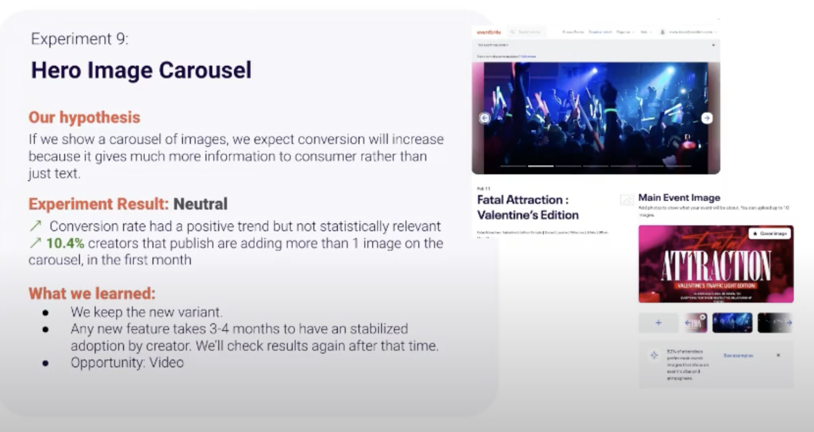
Initial experiment data was also promising for the hero image carousel, Agenda, and FAQ feature releases, shown in the image carousel to the right.
Data also came in later in the quarter (below) that measured the features’ performance to our primary metrics, which were increased publish rate and usage % by our monthly hosting creators, or MHC. Publish rate had increased by +4.35%, while Agenda was used by 11.7% of MHC, while FAQ was used by 9.9% of MHC. We even found that our FAQ content improved our SEO andit attributed to an increase of CTR on mobile devices from 2.8% to 3.1%.


The Retro
Dddd