Monetizing Eventbrite with Publishing Fees
Summary
How do you introduce a new fee to new and existing users when they’re already used to a free-for-free model? I was in charge of introducing and educating creators around new “listing fees” we’d be charging them. I’d be informing users about these fees in the creator onboarding flow and event creation experience.
Eventbrite wanted to start charging creators to list their events on our marketplace. This fee would be determined by an event’s capacity.

Leadership believed our marketplace was valuable and wanted to monetize this part of the business through fees. This new fee would be charged before publishing an event.
The fee amount was determined by a creator’s event capacity, or the total number of tickets available for your event. The plans included a free tier (1-25 tickets), and ranged in price depending on set capacity caps (26-100 tickets, 101-250 tickets, 250+ tickets).
Event capacity had never been monetized before, and was also buried within the ticket creation step of the event create flow.
There were multiple problems to solve here, including:
How do we bring attention to a tool that we’re basing our new fee from, which is already hard to find?
Where do we communicate these fees in the user journey?
How do we effectively communicate Eventbrite’s value so new and existing creators pay for our product?
Event capacity was hard to find…👀
Event capacity was helpful to cap the amount of people who could come to your event due to venue constraints—though this was a more advanced tool and used by experienced creators. And because capacity wasn’t as important of a tool as ticket quantity, it would only appear once a ticket type was created and was placed at the bottom of the ticket hierarchy. The tooltip would inform creators of the definition of event capacity, but that was pretty much it.

The ticket creation step in the event create flow. A drawer would pop out to start creating a ticket. “Available quantity” was the ticket quantity, or the number of tickets available for sale for that specific ticket type.

Once a ticket was created, event capacity would appear below all the created ticket types.
I could communicate the new fees contextually, in the ticket creation step. But that would be subtle—and honestly, kinda shady.

The most low-lift solution with little engineering effort would be to introduce a tooltip into the “Available quantity” input field, which would mention our new fees, limits, and plans. The tooltip’s message would change depending on what the creator inputted (ex. If 25 tickets or below, a different message would appear saying the event was free to publish.)
There were a couple of issues with this approach:
Placement — Event capacity was what we were going to charge by, so wouldn’t it be confusing if we raised this information on “Available quantity,” which was a different input? Shouldn’t we call more attention to the actual tool itself and educate new and novice users of where to find this super-important thing we’re now going to charge them by?
Not actionable — We weren’t providing a link to learn more about our pricing structure. Money is something that can cause anxiety and concern. Would people feel like we’re leaving them in the dark?
My design team and I both agreed that we’d need to do a lot more design and content changes to provide full transparency and education of these fees.
And that we shouldn’t just be looking at this one piece of the user journey—we needed to look waaaaay back, at New Creator Onboarding.
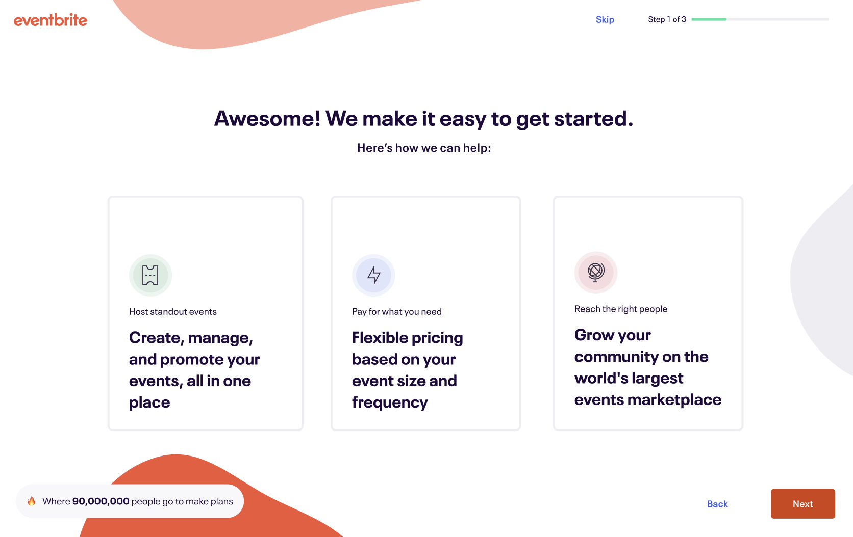
So I started introducing our new fees earlier in onboarding, to prepare new creators for pricing friction later in the create flow.
To effectively communicate about our new fees, we also needed to effectively communicate Eventbrite’s value so that creators would find reason to pay. The first step of our revised Creator Onboarding flow showcased our top value props, which were provided by my Product Marketing partner. I channeled these value props by writing the below in-product content.
These value prop cards could “flip” and provide more information when clicked. One of the cards mentioned our new capacity limits (“Events with up to 25 tickets are free to create.”)
I used positive language (“up to”/“free”) in the messaging to make it sound more enticing and reassuring. I also included data points that mapped to each value, and a playful little badge at the bottom of the screen to show our total customer base, which was the valuable marketplace that creators would now have to pay for.

I also made fees part of our onboarding questions.
I updated our onboarding questions to capture a new creator’s event frequency by asking for the number of events a creator was thinking of creating. I also captured their event capacity by asking them about the number of people that usually come to their events. These questions would help us connect the dots later in ticket creation and at checkout, where their answers would affect the packages we’d recommend.

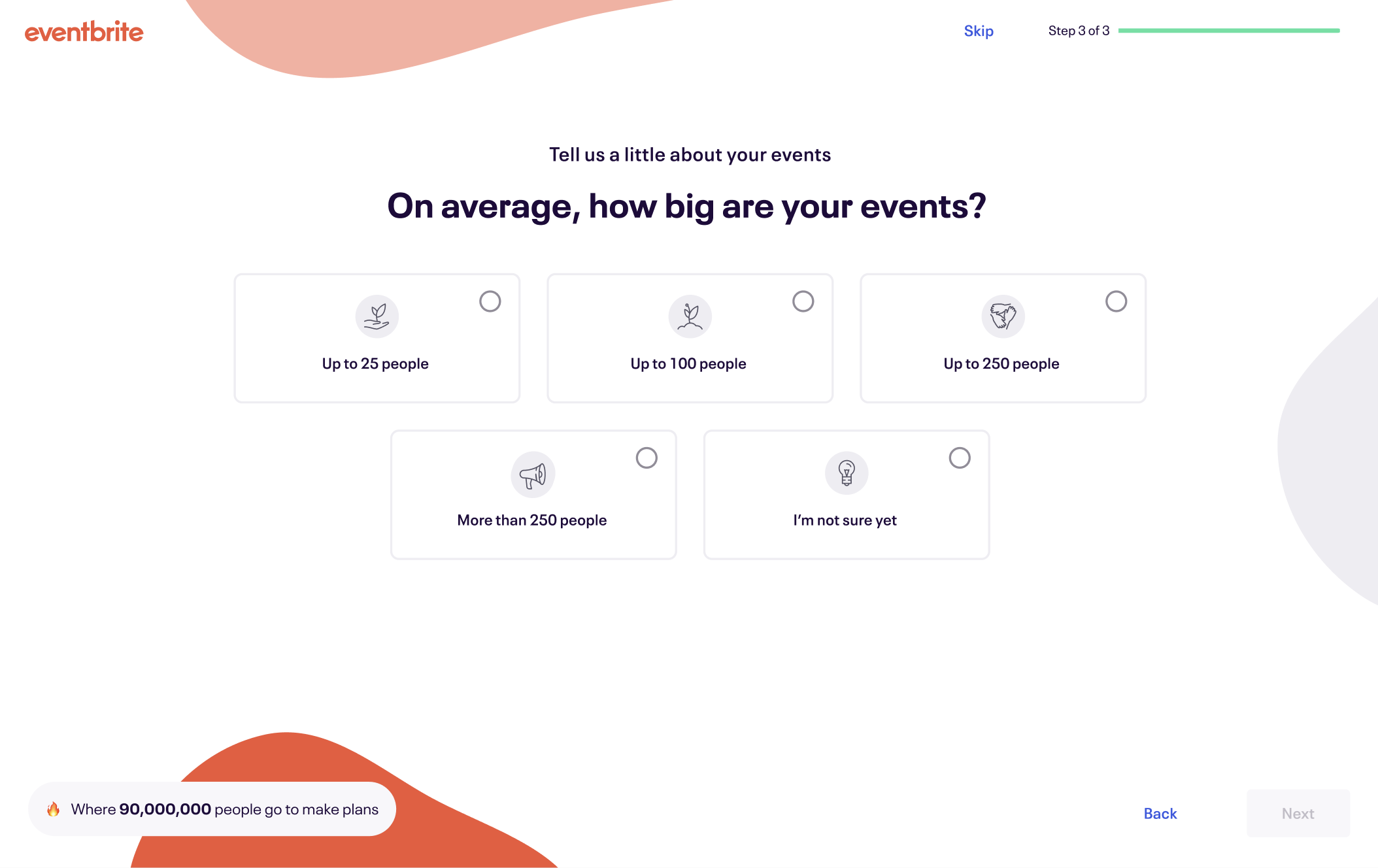
If a creator selected a bigger event size, they’d receive a contextual message mentioning that they may need to pay in order to publish events of that size.
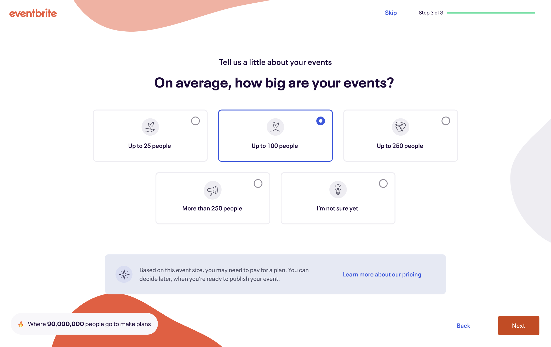
I also included a link to our Pricing page on the Eventbrite website to learn more, even though that would take them away from the main task.
(Because, you know…transparency matters! 😉)
I used reassuring language like “may” and reinforced that the creator can always change their decision before they publish an event.
I didn’t want to make anyone feel like they were boxed into anything, so I wanted to reinforce user agency and control.
The onboarding questions performed well, too!
Data analytics found that ~50% of creators who published their events had the same event capacity they recorded in their onboarding questions. This meant that creators' behavior aligned more with their onboarding response when we compare it to the event capacity than the number of tickets they sold. (This is an important distinction since packages are based on the event capacity that creators enter.)
Creators did generally follow in the trend of their response from onboarding. This means that creators that answer that they are expecting a higher turnout do, on average, have a higher turnout. And creators that are expecting to have a smaller, intimate event usually have a lower turnout.
Cheers to human and straightforward content that could accurately convey what we were asking our users! 🎉
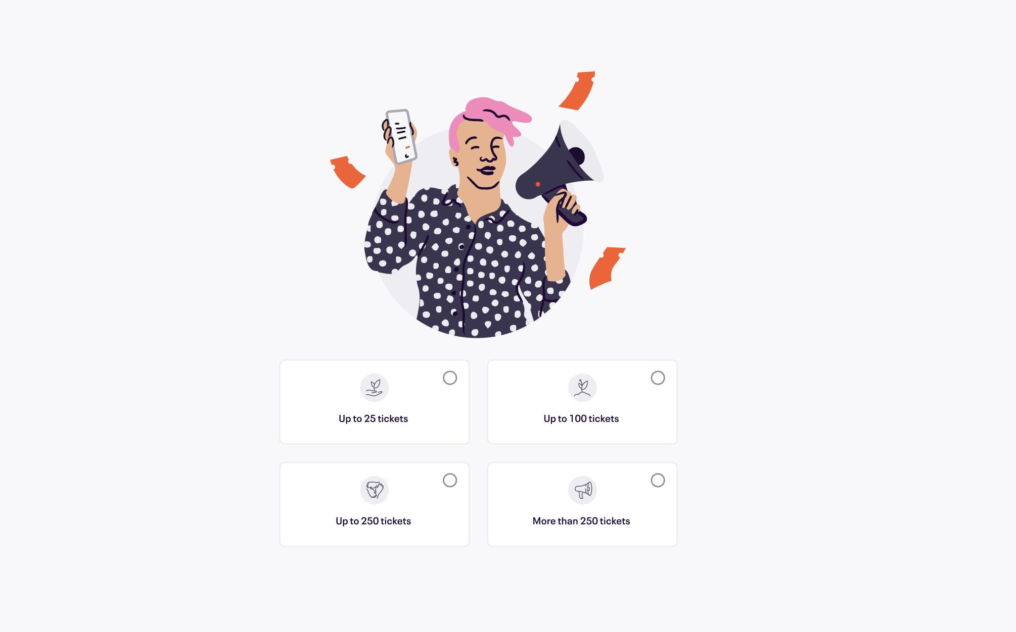
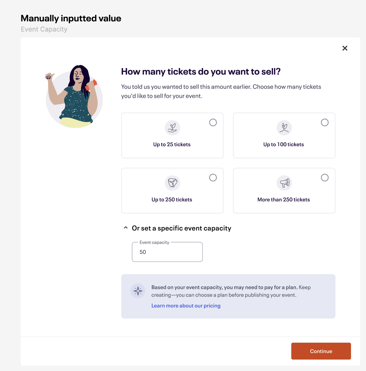
We also created a modal on the ticket creation step that forced creators to set an event capacity. It would also teach them about our new fee model by interacting with it.
Though this caused friction, I thought it was necessary to educate users around capacity, and how capacity and fees were related to one another. Engineering was also able pull the answer the creator had previously made in the Creator Onboarding question and auto-selected that answer here in the modal. Users could still toggle their answers and make changes.
The blue banners at the bottom of the modal were reactive, and messaging would change based on the capacity amount selected. Similar to our onboarding flow, any answer that was “Up to 100 tickets” or higher would be served proactive messaging about being charged, with the same link that took people to our Pricing page.
I wanted to feel inviting, and chose to phrase the ask as a question rather than something more action-oriented like, “Select your event capacity,” or use the term “event capacity” outright like, “What is your event capacity?”
I tried to lean on capacity’s actual definition and keep people thinking about “tickets” since they were in the ticket creation step. Also, these were new users—throwing Eventbrite jargon at them so early in their journey could be confusing and overwhelming!


Event capacity also became more noticeable with some design changes.
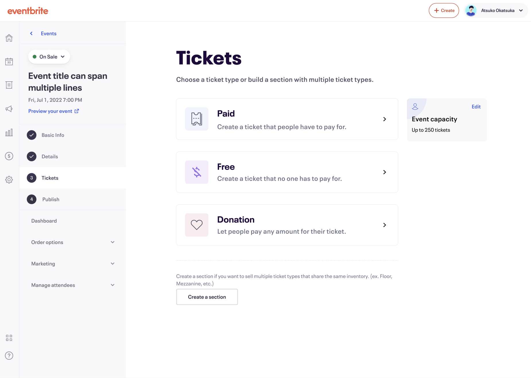
My product designer and I also brought more attention to event capacity by making it into a card that sat higher up in the hierarchy, which also made more use of the empty space on the screen.
Clicking “Edit” would pop up the modal again for people to edit their capacity.
My content and design changes made an impact.

Our design team made a lot of changes to the new creator experience throughout onboarding, event creation, and introducing a new checkout step before publish.
By building this monetization experience, we contributed $5M incremental revenue in 2024, in addition to the $30M we made in 2023.
By jumping straight into event creation after the onboarding questions, we made $216k in annualized incremental revenue, a 3.6% relative increase to First Event Create Saves (FECS), and +125 incremental monthly 1PPs (first paid publishes).
Onboarding completion improved to 65.7% since simplifying the flow and adding messaging around fees and event capacity.
Onboarding answers highly correlated with user intent. ~50% of creators who published their events had the same event capacity they recorded in their onboarding questions. This meant that creators' behavior aligned more with their onboarding responses.
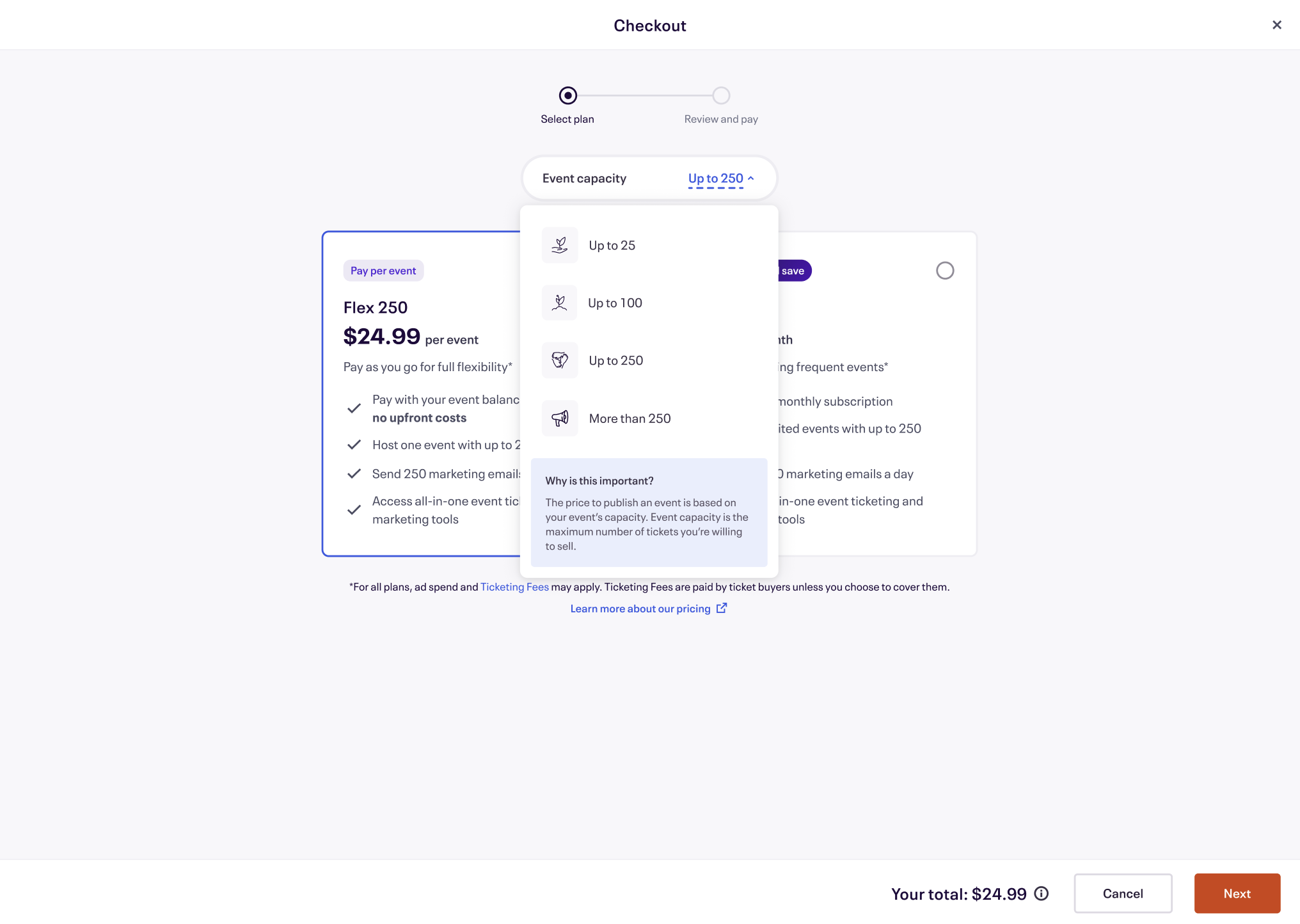
I iterated on content and added prices underneath each capacity tier to strengthen the visual correlation between capacity and price.

I also added an event capacity picker into our checkout experience before publishing an event. This would change prices in real-time.
I also included a “why is this important?” tooltip in the picker to further educate creators on why event capacity mattered, and how it affected the prices they were seeing in checkout.
Previously, users had to go back and forth from the Ticket step to the Publish step in order to “play around” with the price they were suggested. This prevented them from publishing their event because they didn’t have all the information they needed in one place to make an informed purchase decision. This design improvement greatly reduced the number to switch from one step to another.

By making this change, we witnessed a 7% increase in conversion rate from Event Publish Start to Event Publish Checkout, and a 2% increase from Event Checkout Start to Event Publish! While these numbers might seem modest on the surface, the cumulative impact is substantial. Considering our large user base of nearly 300k users at the top of the funnel, this translates to an additional 5,000 users converting, each contributing to revenue growth. Moreover, nearly 100 users chose to upgrade to Pro (our subscription model) soon after this design improvement launched, which bolstered our Monthly Recurring Revenue (MRR). 🚀
But there’s always stuff I could’ve done better. Like…
Rephrasing the modal’s question. We found later in user research that a creator’s “want to sell” number is different than their “can realistically sell” number. This key phrasing greatly affected the user experience because creators were adding a capacity number that was aspirational, and higher than what they’d realistically sell. This led to more expensive packages that were suggested at checkout, which caused negative experiences.
By rephrasing the question to coach creators to input a capacity amount that they’d realistically sell, it could alleviate some of the sticker shock creators were experiencing at checkout before publishing their event.