THE PROBLEM
With the recent launch of a prominent friend suggestion unit in the People You May Know (PYMK) section, users had complained that it:
1) Took up a lot of space.
2) Didn’t know why a certain person was highlighted over another.
3) Didn’t give them an option to hide the unit.
Without a clear name and clear value prop that provided little user agency, this PYMK unit had clear quality issues.
THE SOLUTION
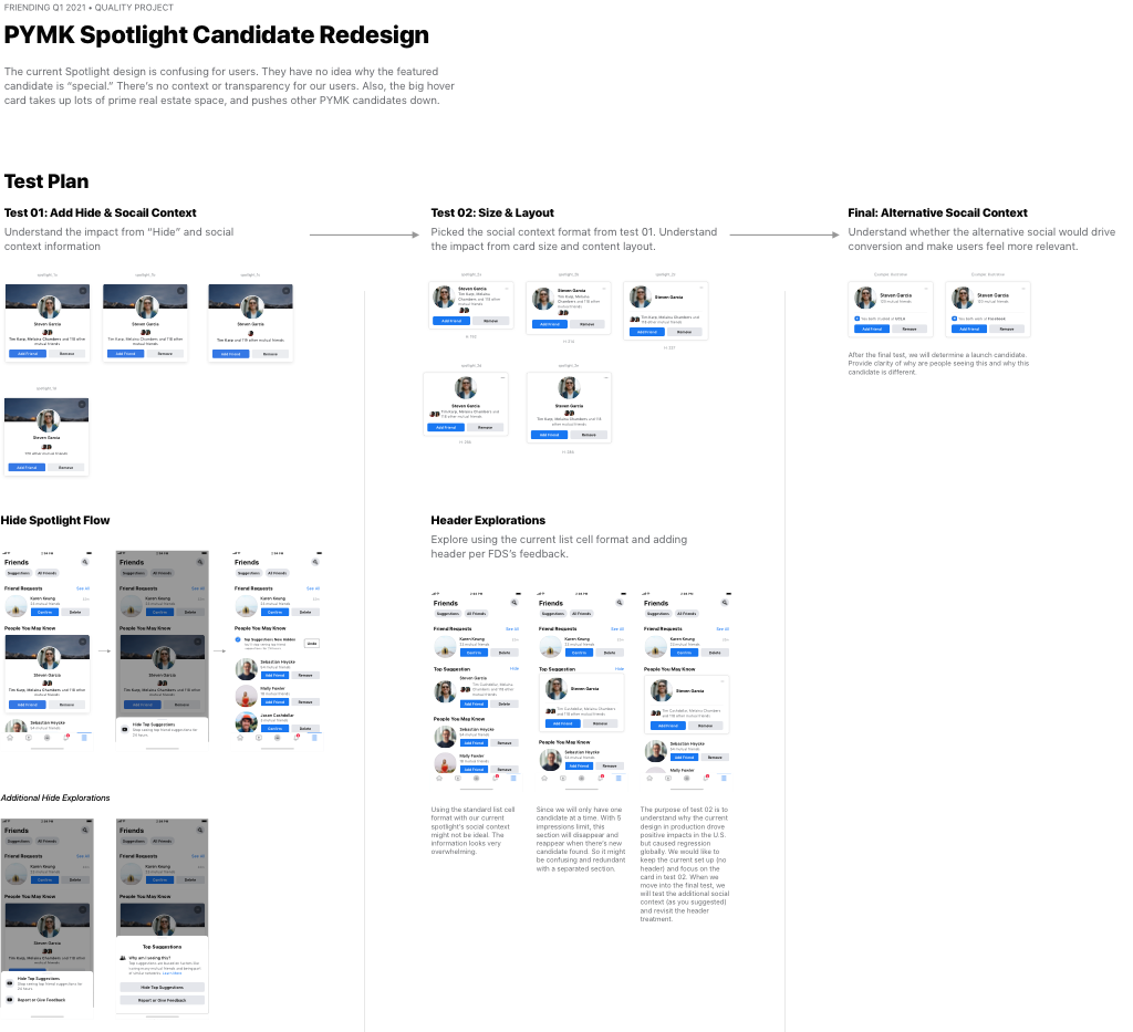
Our team ran a series of three tests to address the above people problems to improve the quality of the unit. The tests we ran were:
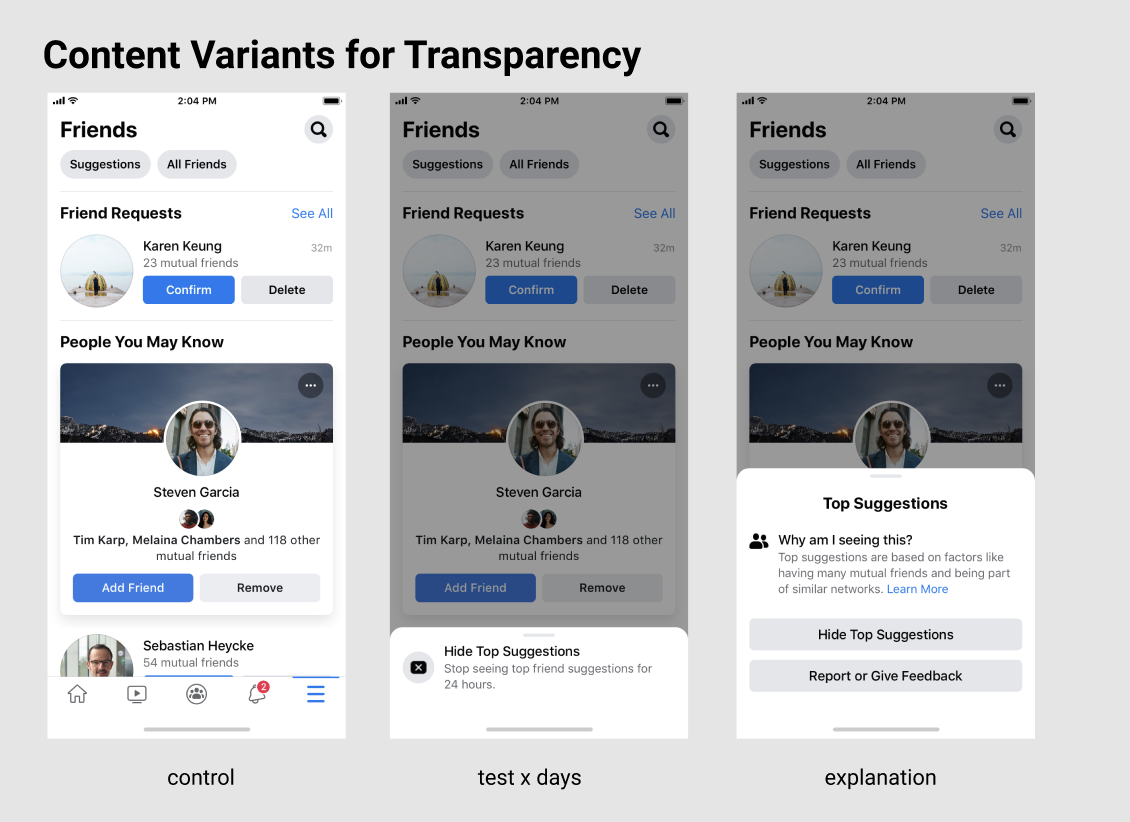
A social context test, to understand the value of each piece of social context by testing short vs. full names, bolding and the number of top mutual friend names shown.
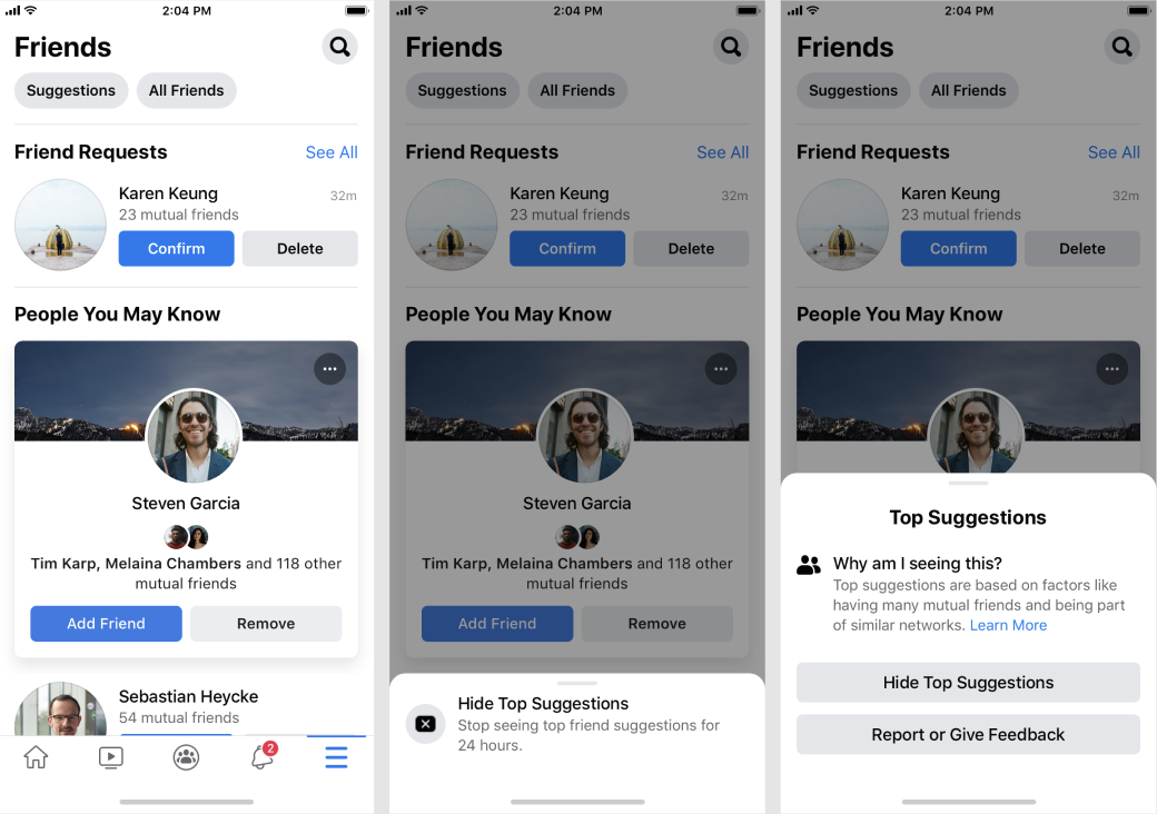
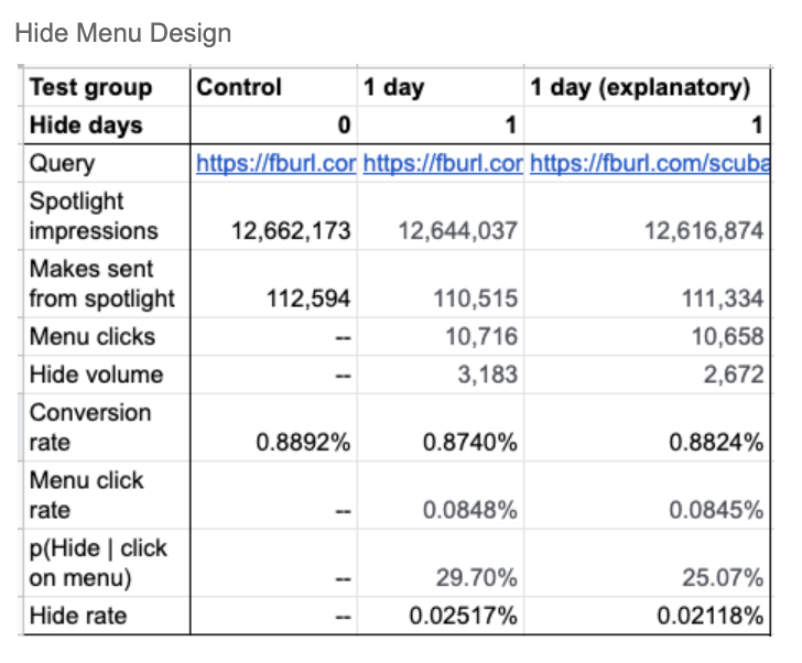
A hide test, which tested 2 overflow menu designs and various hide durations. I got buy-in from the team to test an added layer of transparency into the unit, which would explain to them why the unit is relevant by providing them with a "Why am I seeing this?" section in the overflow menu.
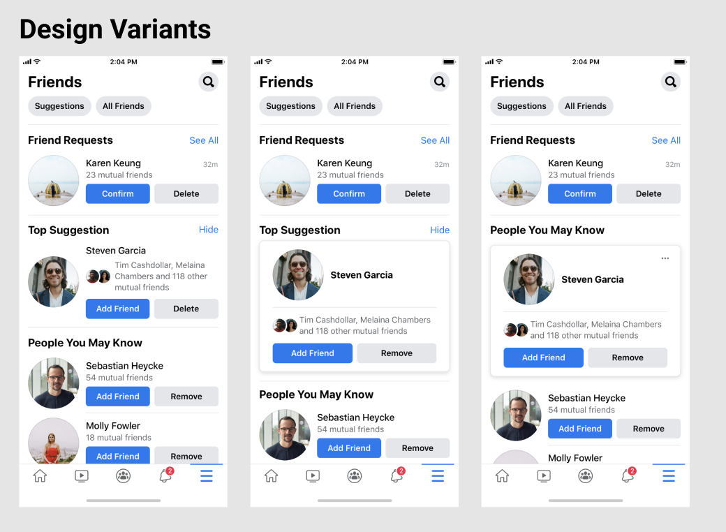
A height test to compare different heights and UI layouts to reduce the space taken on the screen without hurting core friending metrics.
After experimenting, we found that the added explanation led to a higher conversation rate than the other variants.
When users tapped into the overflow menu, they were less likely to click hide in the text variant — which was an indication that the explanatory text did help users understand value of the unit.
THE CONCLUSION
We launched the quality improvements with a card height or 237 px, shipping the hide design with explanatory content, and a hide duration of 7 days (that was also clearly relayed in the content).
These quality content and design improvements led to:
+11k friend requests sent from unit in the U.S.
+0.85% friend suggestion impressions in the U.S.
No significant drops in our topline metrics.
The main takeaway from this project? Transparency is key.